SEVINCH BRANDING
Sevinch is a Turkish name rooted in rich cultural heritage, meaning joy and happiness. At Sevinch, we blend joy with quality. We believe packaging is more than protection for food products; it is a messenger of the moments families share with our products—moments that deserve the highest standards of quality, freshness, and a genuine sense of well-being. Sevinch exists to preserve this feeling, from the very first glance to the final use.

The joy you can taste.
LOGO DESIGN
The logo is built around a minimal, smiling face icon that instantly conveys a sense of joy, friendliness, and appetizing appeal. The smile is executed in a very simple, iconic manner and aligns well with the brand concept of “Sevinch ” which is rooted in happiness. The forms are fully rounded, free of sharp angles, and visually well-balanced, a deliberate choice that positions the brand in the audience’s mind as gentle, trustworthy, and family-oriented. The logo is neither overly luxurious nor excessively playful; it sits precisely in the sweet spot that is highly effective for food FMCG(Fast-Moving Consumer Goods) brands.

LOGOTYPE DESIGN
The English logotype is designed with simple, rounded, and highly legible forms, fully aligned with the brand’s friendly identity. The soft letter shapes avoid sharp angles, reinforcing an approachable and trustworthy feel. A key detail is the V, subtly shaped like a smile, which cleverly communicates the brand’s sense of joy without visual exaggeration. Overall, the English logo is clean, distinctive, and well-suited for a food FMCG brand that requires fast recognition and emotional connection.

PRIMARY COLORS
The logo uses a balanced color strategy aligned with food branding—green for freshness, nature, and trust, and orange for warmth, energy, and appetite appeal. Together, they create a clear sense of health, positivity, and approachability, supporting strong recognition and emotional connection.

PATTERNS
Sevinch’s brand patterns are built on a simple, cheerful, and memorable visual language—combining circular forms, soft lines, and elements inspired by the smile motif within the logo to create a warm, friendly, and vibrant identity. More than decorative graphics, these patterns function as an integral part of the brand’s design system, bringing consistency across packaging, promotional materials, and various brand touchpoints. Through rhythmic repetition, minimal forms, and the balanced use of green and orange, they subtly communicate freshness, energy, quality, and positivity. The result is a distinctive visual signature that makes the spirit of Sevinch recognizable even in the absence of the logo.

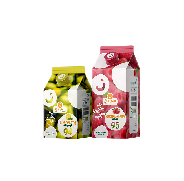
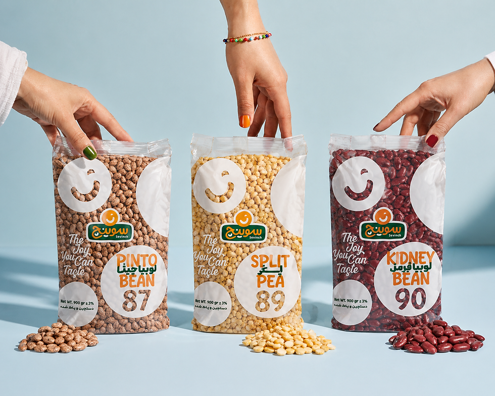
Package
Design
The joy you can taste
The packaging is designed with a simple, friendly, and human-centered approach that communicates joy, trust, and appetite appeal at first glance. Its clear structure, vibrant colors, and rounded forms create strong shelf presence and quick recognition in a competitive FMCG market. Built with consistency and flexibility in mind, the visual system is easily scalable across future product categories while maintaining a cohesive brand identity.


STATIONARY
The Sevinch stationery set is designed as a seamless extension of the brand’s visual identity—where freshness, simplicity, and a warm character are reflected across every touchpoint. From letterheads and business cards to folders, desk flags, and shopping bags, each element follows a unified design system built around clean layouts, circular graphic forms, and the brand’s signature green and orange palette. More than a collection of printed materials, this stationery system reinforces brand consistency, creating a professional, memorable, and cohesive experience in every interaction.


SALES REPRESENTATIVES
The Sales Representatives identity was designed to extend Sevinch beyond products and into human interaction. From uniforms and branded accessories to in-store presentation, every element follows the brand’s visual system—clean, approachable, and confidently recognizable. The use of Sevinch’s signature green and orange palette creates a sense of trust, energy, and consistency, ensuring that every representative becomes a living expression of the brand’s personality. More than a uniform, this system builds presence, professionalism, and a stronger connection between Sevinch and its customers at every point of contact.


Slogan

