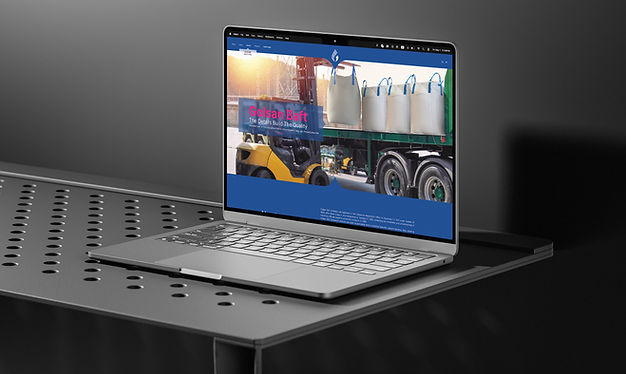
GOLSAN BAFT
Bold colors, minimal layout, maximum clarity. A website that reflects GolsanBaft's brand identity at every detail — from palette to typography to structure.
UI/UX Journey
From the first click to the final inquiry, every step of the GolsanBaft experience was designed with the user in mind. Clear navigation, progressive content reveal, and a logical page flow guide industrial buyers — from brand discovery to product specification to contact — without friction or confusion.

Challenge & Approach
Challenge: Designing a website for an industrial manufacturer that feels modern and distinctive without losing the trust and credibility that B2B buyers expect. The core tension: how do you make a jumbo bag factory look memorable?
Approach: By leading with brand, not product. The design anchors every page in a strict color system derived directly from the brand book — navy blue for structure and reliability, hot pink for identity and differentiation. Photography does the heavy lifting for context, while the layout stays deliberately simple, letting the product speak without visual clutter. The result is a site that feels custom and considered, not templated — which in an industry full of generic competitors, is itself a statement.


